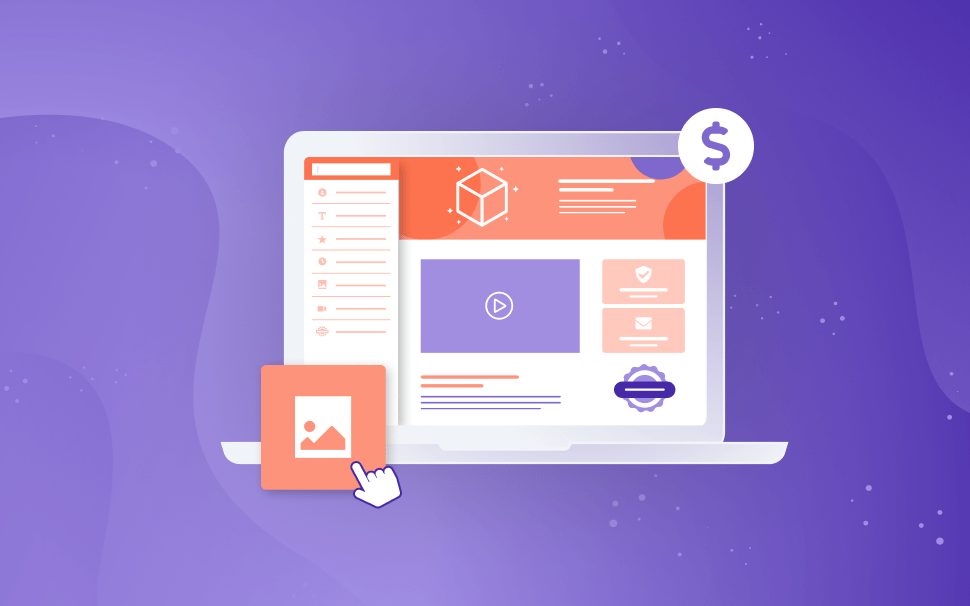
[GUIDE] How to build custom checkout pages that convert
Hotmart has a powerful solution for customizing your checkout pages. Check out this guide on how to add elements that will make all the difference in your buyers' experience and boost your conversions.

What will we see in this post
When talking about products, whether physical or digital, we need to keep in mind that the visual aspect is very important and must be thought out with great care and attention. By using visual resources combined with the right strategies, it is possible to generate more credibility for your product and more security for your potential buyers.
There’s no point in directing thousands and thousands of people to your checkout page if, when they get there, they give up on their purchase for some reason. To avoid this kind of problem and help you boost your conversions, we have analyzed the checkout pages that convert the most at Hotmart and have created this guide.
Here, you’ll find several best practices on how to customize your checkout page, which is the environment where your buyers need to make one of the most important decisions within the shopping journey: providing personal and financial information. Moreover, we hope that with this content, you can make the most of our customization solution to improve your checkout page’s design and boost your results.
Your Checkout Page should match your business’ visual identity
Customize the look and feel of your checkout page so that it has the same visual identity as your website and sales page. Keep in mind that all steps of your buyer’s journey need to be connected in some way, so they don’t feel like they’re going through so many steps.
Never forget to create your checkout page’s mobile version
Hotmart studies show that over 80% of visitors get to your checkout page on their mobile devices. Can you imagine what happens if your page isn’t optimized for mobile? I know you don’t want to miss the chance to sell to those people who have visited your page. So before you post your customized checkout page, make sure everything is okay with your mobile version.
You can also take advantage of Hotmart Analytics to access super-relevant data about your digital business, including how users behave on your checkout page when they’re on mobile devices.
Don’t forget:
- Be careful not to create a page that’s too long and has too many elements. Mobile browsing has a much smaller screen than on a computer, so the path to checkout needs to be short.
- Your mobile checkout page version doesn’t need to have the same elements as the desktop version. Keep in mind that the habits and behaviors of people in each of these versions are different, so their look and feel can and should be thought of in a different manner.
Use the same colors, fonts, images, and other visual elements you use in your product page
The checkout pages that convert the most at Hotmart use the same visual elements and design they use in their sales page.
Visual representations can be more powerful than you might think when it comes to influencing people. It’s often easier to remember a striking image than something you read or hear.
In addition, most people find it strange when they suddenly change from one environment to another, feeling insecure and suspicious. This is because unconsciously, their brain realizes that something has changed, so they feel strange and go into a state of alert.
If, while browsing your website, customers click the buy button and are directed to a checkout page with a different visual identity than the one they saw before, this can hurt your sales and lead to shopping cart abandonment.
Don’t forget:
- Don’t add too much content before the fields where buyers enter their payment information. People don’t want to scroll down forever before completing the purchase.
- You need an easily legible font size. Users need to read your content on any screen without difficulty.
These tips apply to the desktop version and especially to the mobile version. When in doubt, perform tests on your smartphone!
Use the Exit Popup
The exit popup is a message that appears when buyers want to leave your checkout page without making a purchase. It gives your buyers time to think about whether they want to abandon the cart, and consequently, this can increase your conversion rate. You can offer a discount and talk about the benefits they’ll be missing out on if they give up on the purchase.
Don’t forget:
Make sure you write a persuasive text: Use a message that shows that you can’t believe that they’re going to give up on the purchase; that you don’t believe that they’re really going to let the opportunity pass by.
Think about powerful CTAs: It’s worth including a phrase in the button that represents the action you want them to perform, such as “I want to go back and complete my purchase” or “I don’t want to leave.”
Create scarcity and a sense of urgency with a countdown timer
Using a countdown timer on your checkout page can increase your chances of making a sale. Phrases like “Today only!”, “For a limited time only” or “You’ll only find an opportunity like this today” are catchphrases well known to all of us, right? And Hotmart’s countdown timer works in a similar way, but it still has the visual stimulus of minutes and seconds being counted down to increase your buyer’s sense of urgency.
This strategy is completely related to the scarcity and urgency triggers that work quite well when you’re offering a product that isn’t always available. And also, when you have a promotional price.
Scarcity mental trigger
This helps speed up your potential customer’s decision-making process because it creates the feeling that they might miss a great opportunity. By using the countdown timer, you make your offer even more valuable because it’s scarce; it will be available for the time that only you can control.
Urgency mental trigger
It consists of setting a deadline for the offer to end, and the countdown timer displays this deadline so that customers think very carefully before giving up on their purchase or leaving it for later.
Don’t forget:
When using the timer, avoid including too many elements and information. Keep in mind that you’re creating a sense of urgency, so you need people to finalize the purchase quickly. In this case, it doesn’t make sense to include a lot of text and too many images that will take a long time for buyers to read.
Think about a text that makes sense with the triggers you’re using. If you add a countdown timer to your checkout page, your message needs to make it clear that your offer is for a limited time. In other words, your text needs to say something like, “Fill out the fields below right away, because this offer ends soon”.
Use Order Bumps on your checkout page
Did you know that here at Hotmart, about 20% of customers buy more than once from the same producer? With this in mind, including the Order Bump on your checkout page can be a great opportunity to increase the value of your sale directly on your checkout page.
The Order Bump allows you to include another product close to where your buyers will fill in the payment information so that they can take advantage of the purchase they’re about to finalize and purchase an additional product. This way, you offer a better experience to users and boost your results.
Don’t forget:
- The product offered in the Order Bump needs to complement the main one; it can’t be just any product, just because you want to sell it, okay?
- It is recommended that the Order Bump product have a lower price than the main product. First, this solution creates a type of purchase upgrade by complementing the product and not exceeding it (especially in terms of price). Second, for a pricing strategy, because the Order Bump doesn’t allow checkout installments, so if the buyer purchases the main product in installments, the order bump product will be paid together with the first installment.
- It’s important that your offer be truly attractive. For example, a product that you sell for $20.00, and if the buyer decides to buy the Order Bump, they will pay only $10.00. Keep in mind that the user is in the last step of the purchase, so the chances of conversion are greater.
Show reviews from your customers
Nielsen, a New York-based company specializing in marketing surveys, states that approximately 66% of consumers trust customer reviews. Therefore, using social proof and reviews can be a great way to reaffirm the transformation your product causes. Let’s suppose that your buyer has reached the checkout page but still has a twinge of doubt about whether to complete the purchase. Testimonials and reviews from those who have already purchased your product can help them make that decision with greater confidence.
Don’t forget:
- Never use reviews from fictitious people and made-up texts. Social proof will only fulfill its role if they are, in fact, real testimonials, from people who actually bought and liked your product.
- Avoid long texts. The testimonials need to show, quickly and clearly, that your product delivers what it promises. It isn’t necessary to include the entire story of the person providing the testimonial. You’ll have other opportunities to use it in full, in a video, for example, or in content where the focus is really on the potential buyers reading it. However, on the checkout page, testimonials should serve to provide them one more assurance that your product is what they need at that moment.
Guarantee seals increase your buyer’s trust
Everyone has probably heard the famous phrase, “Satisfaction guaranteed or your money back,” right?
When customizing the look and feel of your checkout page, it’s possible to include guaranteed safe shopping seals. And even if you’re a person who contributes to the Hotmart OnePercent project, which allows Producers to choose to collaborate with a social institution by donating a percentage of their commissions at the time of product registration. You can donate directly through the platform or from the Hotmart Sparkle app.
Don’t forget:
- Be careful with visual pollution, i.e., don’t put all the existing seals on your page. If you have already added images, social proof, buyback elements, and a long text, including 3 other types of visual elements can create visual pollution on your page. Instead of attracting your buyer to finalize the purchase, you might confuse them.
- Keep in mind that seals serve to increase your buyer’s trust. Always think about which one is best suited for your product; for example, if your product has a higher price or is a subscription product, the guarantee seal might be an interesting addition.
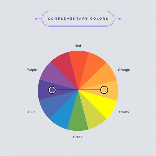
Colors matter!
According to surveys, 93% of consumers consider visual aspects to be the most important factor contributing to decision-making when purchasing a product. “Colors account for 85% of why you people buy a specific product,” says Neil Patel.
Not paying attention to the colors you use on your digital business’ pages might be a huge mistake. At the same time, if you conduct a color study and choose colors that represent the essence and purpose of your product, the results can be amazing.
On the Internet, there’s a lot of free content about the psychology of colors, but we can affirm that a good way to go is to choose complementary colors to highlight your pages’ elements. For example, if your page’s background is a shade of purple, your button with the CTA (call-to-action) can have a color that complements the background; in this case, yellow or orange can create a good contrast.
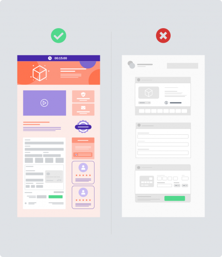
Less is more
Information overload on a checkout page isn’t a good way to go.
Browsing your checkout page should be objective, so don’t overdo it with too many elements. Your checkout page is neither your sales page nor a website; it must fulfill the role of converting the sale.
Be careful with texts and elements that can create distractions and take the buyer away from the main focus, which is to complete the purchase. When in doubt, ask a friend or someone who is not involved in your digital business to take a look at your checkout page and tell you their impressions. This can help you review if all the elements that are there are necessary and if they can really help in the purchasing decision.
In summary…
What to do when building a high-conversion checkout page
- Your checkout page needs to be visually pleasing. Compare a messy and unorganized supermarket aisle and one that is organized to help you find the items you want and shop faster.
- Match the same visual identity of other pages and channels related to your product (sales page, ads, social media, etc.)
- Don’t forget to set up the mobile version first.
- Include elements that show your buyer is in a safe and trustworthy environment (guarantee seal, refund period, social proof, etc.)
- Don’t create long texts; add only the most relevant information about your product.
- Include elements that speed up the decision-making process by creating urgency, such as the countdown timer
- If it makes sense for your strategy, include elements that let you put additional products at checkout, such as the Order Bump.
- Recover buyers who are thinking about giving up on the purchase by using an exit popup.
- Focus on contrasting colors.
- Don’t add too many elements to your page! Only use what is relevant and makes sense for your business.
- Create a layout optimized for mobile devices and another one for desktops; choose what works best for each version.
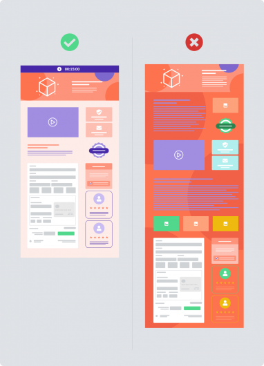
What to avoid when customizing your checkout page
- Distractions (excessive information, too many images, photos, and texts)
- Irrelevant information
- Too many elements in the mobile version
- Colors that make it hard to read (e.g., yellow on a white background). Remember to use contrasts, and when in doubt, perform a test: take a screenshot and add a black and white filter to it; if you can read it, it’s a sign that the contrast is good.
There are many right answers when it comes to the elements you should use
Our Checkout Builder gives you all the flexibility you need. We can tell you that customizing your checkout page should help buyers feel comfortable and safe enough to include their personal and financial information in the final step of the purchase.
Remember what we said at the beginning of this guide: people are often suspicious when there’s a sudden change of environment. Therefore, if your product’s presentation page is very different from the page where buyers will be making the checkout, it can make them feel insecure.
The design and layout of your checkout page help ensure that during the purchasing journey, the transition between pages is subtle, and the buyer doesn’t feel this change of environment. Take the time to customize your checkout page now; you’ll definitely see a boost in conversions.